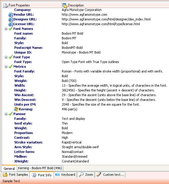
General Tab:
 Kerning Tab:
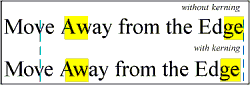
Kerning:
Definition: Kerning is the adjustment of space between pairs of letters to make them more
visually appealing. Some type comes with kerning pairs, commonly kerned pairs of letters
with the spacing already adjusted for best visual appearance so that manual kerning of
headlines and subheads is unnecessary. Not all programs can access the kerning pairs found
in some fonts. Other programs not only read the built-in kerning information, but can also edit
the kerning pairs to change the kerning or add additional kerning pairs.
Example: Some commonly kerned pairs include Wa, To, and Ya. Some typefaces may have
hundreds of kerning pairs defined.
Panose:
Family Kind
The Family Kind digit is used to trigger additional, as yet undeveloped, extensions to the
PANOSE classification system. In the current incarnation of PANOSE a large amount of
information is stored for text and display faces for the purposes of font matching and
replacement. Script and decorative fonts receive little classification, but enough to separate
them from the text and display faces as well as from each other.
Serif Style
This digit describes the appearance of the serifs used in a font design and groups them into
one of 14 general categories. Serif and sans serif faces are classified within this digit.
Weight
The Weight digit classifies the appearance of a font's stem thickness in relation to its height.
It offers ten gradations, ranging from Very Light to Extra Black.
Proportion
The Proportion digit describes the relative proportions of the characters in the font.
Distinguishes Monospaced from Proportional, Modern from Old Style, and Extended from
Condensed.
Contrast The Contrast digit describes the ratio between the thickest and narrowest points on
the letter 'O.' The uppercase 'O' is used because it is generally of higher contrast than the
other characters of the alphabet.
Stroke Variation
The Stroke Variation digit further details the contrast trait by describing the kind of transition
that occurs as the stem thickness changes on rounded glyph shapes.
Arm Style
The Arm Style digit describes diagonal stems and the termination of open rounded letter
forms. The uppercase 'A' and 'C,' along with other relevant characters, are used for this
classification.
Letter form
The Letter form digit differentiates between normal and oblique fonts and describes the
roundness of the character shapes.
Midline
The Midline digit describes the placement of the midline and the treatment of diagonal stem
apexes.
X-height
The X-height digit describes the relative height of lowercase characters and the treatment of
uppercase glyphs with diacritical marks